Designer Maria Montes is a life-long learner when it comes to lettering and typography. Splitting her time between Barcelona and Melbourne, she works on custom lettering projects, illustrations, and type design, and once a year she travels to the remote village of Cabanabona (about 75 miles from Barcelona) to study lettering and calligraphy under the tutelage of Keith and Amanda Adams. There she immerses herself in historic manuscripts, studying lettering techniques from the masters to improve upon her skills.
She says, “I have a strong graphic design background and I am very passionate about all kinds of letterforms: from calligraphy to lettering to typography. I am daily training my eye to become a better designer.” And Montes isn’t selfish with her knowledge. She teaches calligraphy workshops in Melbourne, and speaks at design conferences sharing her work and fondness for details.
“I have a strong background in calligraphy and typeface design, and both disciplines are extremely technical where attention to detail is key. When I draw organic forms, I loosen up and look for energy instead of technicality. I never looked actively for this style of illustration but I am personally drawn to details,” she notes. One of her favorite quotes is by Giorgio Armani: “To create something exceptional, your mindset must be relentlessly focused on the smallest details.”
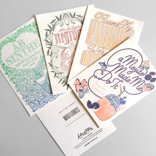
A couple years ago, Montes was invited to participate in the Ladies of Letters series, Flourish Together by designer Carla Hackett and letterpress printer Amy Constable (Saint Gertrude Fine Printing) to design a series of four letterpress cards. “At the time, I was already in the middle of putting together my first solo exhibition in Melbourne, called Breaking The Ice. It consisted of a series of eight full-color illustrated cocktail artworks and pattern prints, so I offered to convert four of my full-color pieces into two-color letterpress cards, and they agreed instantly.”
What you see below is the result of the collaboration and the details
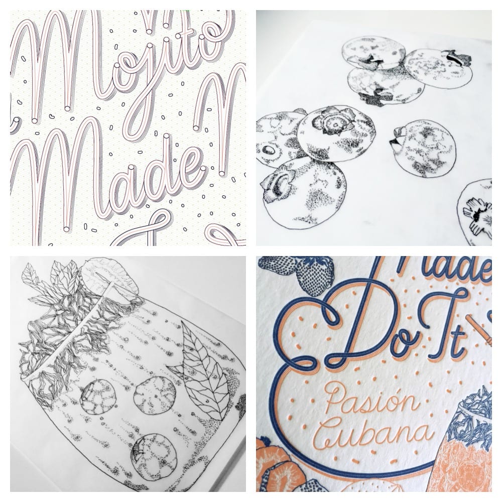
Mojito cards
There was a long research process for each illustration. First, I look for the message, something naughty and fun at the same time. Based on the origin of the cocktail, I try to add some cultural references to the piece. Then, I sketch the lettering and I go through many iterations. The base for each lettering style is my own calligraphy. After the calligraphic sketch is balanced enough, I use tracing paper and I redraw all letterforms adding or removing weight, contrast and adjusting letter spacing.
For the Mojito card, the original full-color piece features the actual colors used in a Mojito, but being restricted to two colors for this series, made me reconsider the colors so they would work well with the other cards.

Absinthe images
I was a little worried that the hairlines in Absinthe wouldn’t reproduce well in letterpress. Each piece was born as a large format, full-color artwork, so I went through a reduction process where I removed elements and the color palette, but kept the soul of each piece intact. Each card has been digitally redrawn using vectors. I asked Amy for the minimum line stroke to make sure that the letterpress would translate all details, and the result was great. The color palette is clearly inspired by the popular Green Fairy name associated with Absinthe. I wanted to create a glowing visual experience.
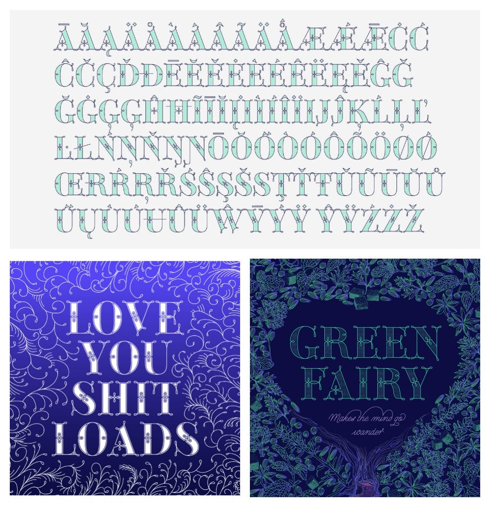
Green Fairy alphabet
“Absinthe” was originally a custom-lettering design. This design got stuck on my mind and a year later, I went back to it and drew all 26 letters of the uppercase alphabet using Illustrator. The result is Green Fairy, which started as one weight, but quickly turned into a layered/chromatic font.
Currently Green Fairy is a font family of 6 weights (chromatic layers). The font is close to be finalized and commercially available. You can subscribe to my mailing list to be up to date with the release date.
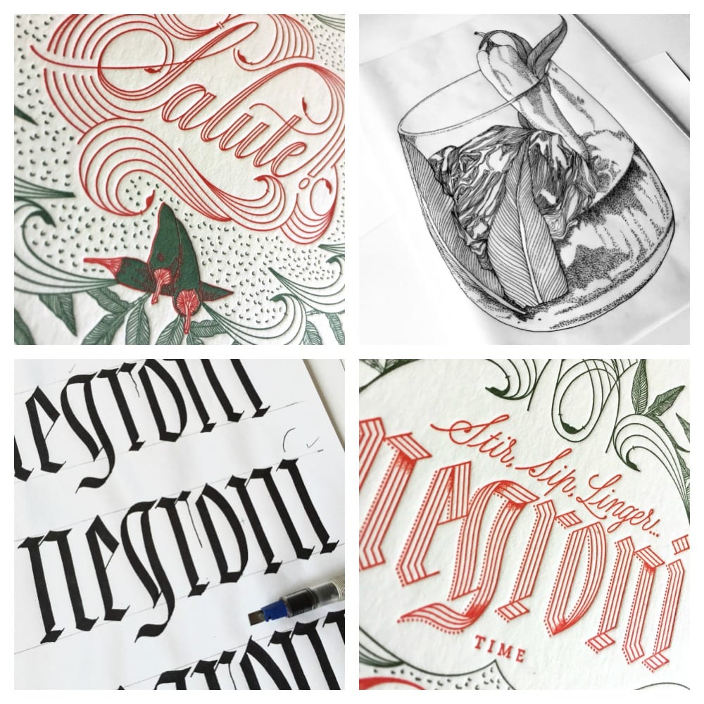
Negroni
The inspiration behind my Negroni artwork is a blog post from BonAppetit.com called How to Drink like an Italian. On this post, Andrew Knowlton states: “Italians drink differently than we do. They sip, stir, linger over low-octane cocktails.”
The cocktail venue where my solo exhibition was hosted, offers a variation on this cocktail called Chilli-Choc Negroni. I love chillies so I decided to go ahead with this version of the classic Italian drink.
I wanted to use the colors of the Italian flag without being too obvious. Chillies gave me the red color palette I needed, so I began to illustrate them as my starting point. The other ingredient from this cocktail’s recipe is Vietnamese mint, which became the second main element. Initially, the ingredients were drawn by hand and colored on the computer. For the letterpress printed version of the artwork, I redrew all the ingredients in vector format again.
Following the Italian theme, I wanted to introduce an Italian word that could be easily understood in English, so I chose salute. This lettering has been designed using my own Copperplate calligraphy as a reference. On the other hand, negroni is a lettering design based on my own Fraktur calligraphy.
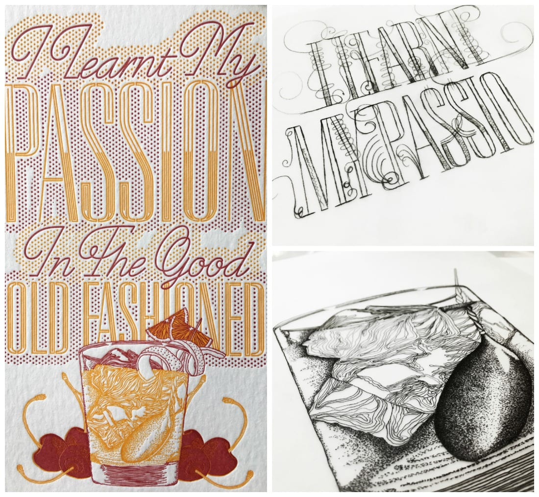
Old Fashioned
My desk is divided between analog and digital tools. On the left side, I have my pens, brushes, inks, paper and an A2 lightbox that I love. On the right side, I have my computer, Wacom tablet, camera, and iPhone. I think in your work you can either specialize or you can be versatile, and do different things in different ways. I get bored easily, so I like jumping from one discipline to the other or ideally, combine them when possible.
Next year, Montes is having a solo exhibition at the Contemporary Art Center La Panera in Catalonia. She says, “The space is amazing and the crew I am working with is incredibly supportive. I am really excited to share new work with friends and family.”