Joanna Muñoz, founded Wink & Wonder in Los Angeles, Calif., in 2013, as a freelance creative outlet outside of her full-time job as a graphic designer. “I got engaged not long after starting out and my work suddenly shifted toward calligraphy/lettering, as I documented the process of creating stationery and signage for our wedding. Everything else just kind of fell into place from there,” Muñoz says. “I stumbled across the Goodtype Instagram feed and was hooked. I felt like I struck gold finding a really great community to be a part of.” She’s been busy working on hand-lettering projects ever since.
Here, she shares advice and techniques to help aspiring lettering artists get started and follow their passion.
1. What tools are best for people just getting started in lettering?
I’m a big fan of using what you have at your disposal before going on a shopping spree. The reality is that tools can only take you so far. It’s consistent, mindful practice and learning the fundamentals that will help propel your work forward.
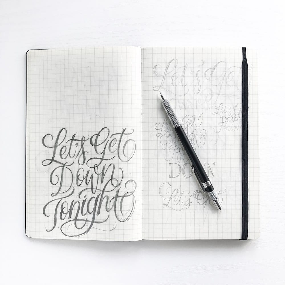
Pencils— I’ve experimented with tons of brands, but always fall back on a few favorite tools: My go-to pencil is the .5mm Alvin Draft-Matic Pencil – the lead is thin enough for precise lines but wears down with use and creates that same texture you get from traditional graphite pencils. Using mechanical pencils alleviates the need for sharpening. For erasing, I use a kneaded eraser as it’s mess-free and does a great job of getting rid of lines.
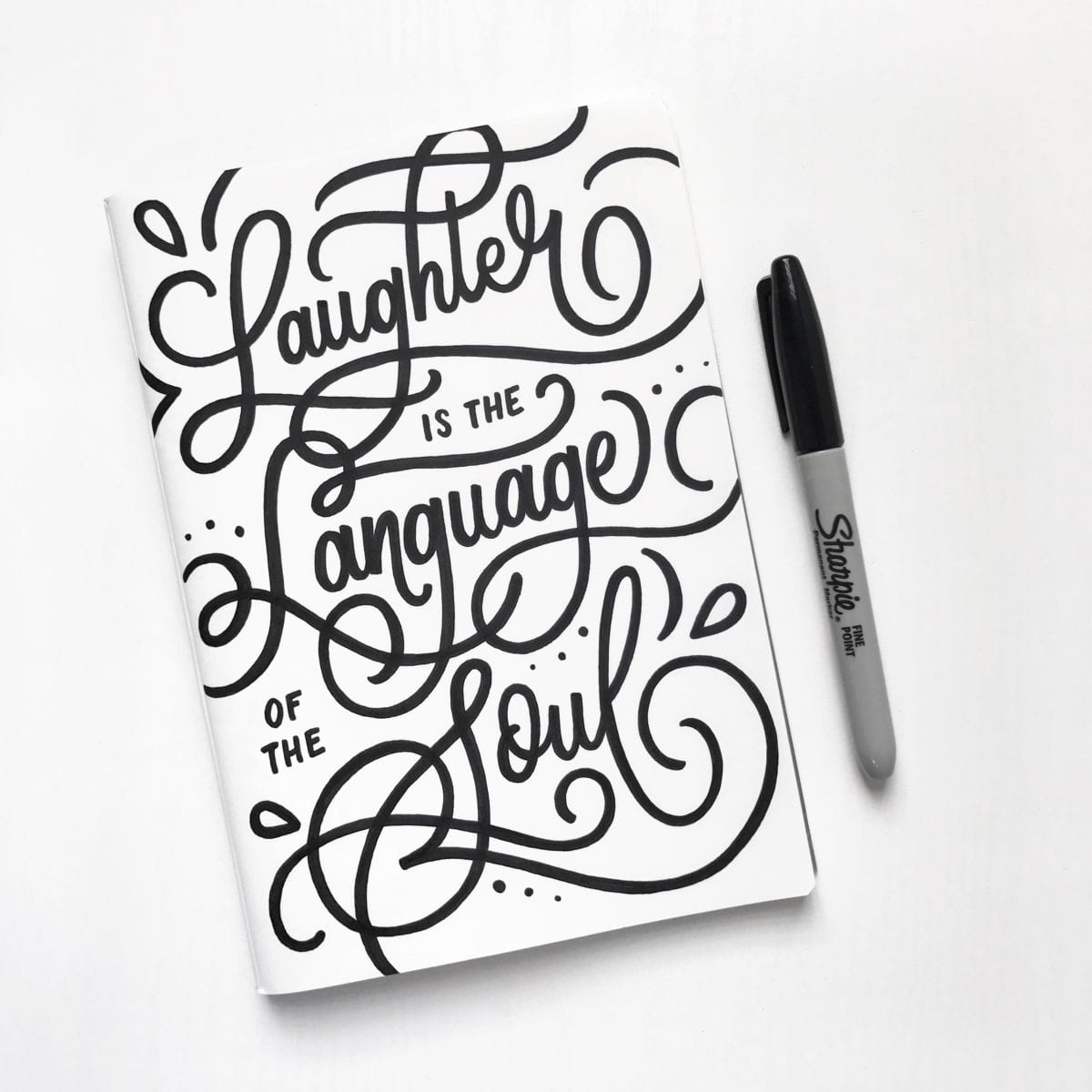
Pens— I mainly use the Tombow Fudenosuke Hard and Soft brush pens when I initially create a piece. The soft brush pen has plenty of flexibility for me to create thick and thin lines by applying or releasing pressure, while the hard brush pen offers a little more structure and rigidity. I also use Micron pens (mostly .005, .01 and Graphic) for refining lines, and a Sharpie Brush Tip marker for filling in big areas with black ink.
Paper— I love Moleskine grid notebooks for sketching ideas, Pocket Scout Books for lettering on the go and Canson Marker Paper when I need to create a final piece because it’s super smooth, bleed-proof when inking, and transparent enough to use with a guide underneath the page.
Are there certain warm-up exercises you do?
If I’ve taken a longer break than usual, I typically jump-start my muscle memory by writing out the alphabet (in cursive) until the rhythm of the pen or pencil starts to feel natural again. Most days, I simpy start out with really loose sketches of a concept to warm up.
What basic techniques would you recommend for a beginner?
Learn the letterforms – Understanding the different elements of each letter – serifs/san-serifs, x-heights, ascenders/descenders, flourishes, etc. – and how they work together will really up your hand lettering game. If you’re drawn to script styles, learning basic calligraphy will do wonders for you as well.
Relax – Having a death grip on your pen/pencil and applying too much pressure will cause your hand to tire out faster and create forced lines and letterforms. Ease your grip and (literally) go with the flow.
Go big – Sketch your concepts out as a whole word or phrase, and don’t draw letter by letter in full detail. Sketching loosely and focusing on the bigger picture will help you determine the overall composition of your piece. It’s best to create several quick layouts and include all of your design elements to see what works best (or doesn’t), especially if you’re using a photo and incorporating lettering. Once you’re happy with the structure of a piece, you can move on to refining the details.
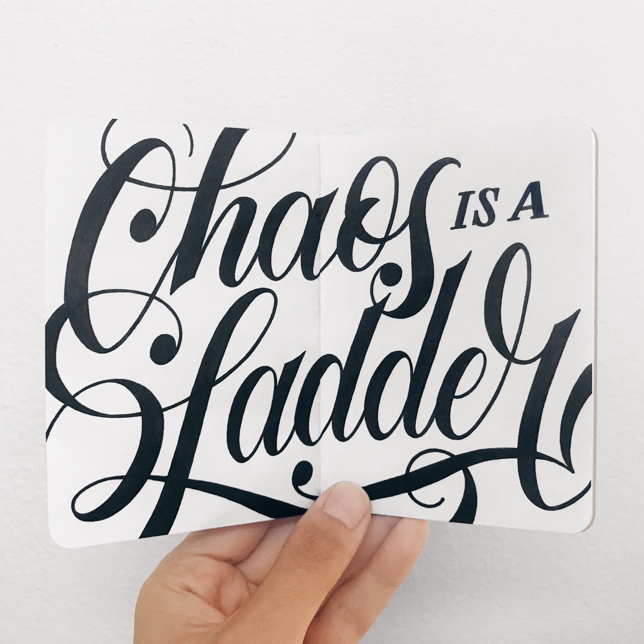
Contrast is key – When using brush pens, you’ll generally want to apply pressure on a downstroke to create thicker lines, and release pressure on an upstroke to create thin lines. The change in pen pressure will create varying line width and give your work some added dimension.
Where (or who) do you look for inspiration?
Instagram is my social platform of choice for inspiration. I’m a huge fan of @Goodtype’s wonderfully curated and very diverse feed, where you can see artwork from concept to completion and in every medium imaginable. Founder, Brooke Robinson, also does a phenomenal job of showcasing new artists alongside well-known ones.
In terms of inspiration, Gemma O’Brien, Jennet Liaw, Becca Clason, Lauren Hom, Nick Misani, Noel Shiveley, Adé Hogue, Christopher Craig, and Danger Dust never cease to amaze me. Not only are they talented, but they all create pieces with an incredible attention to detail and have mastered a variety of lettering styles.
Do you have a practice project you would recommend for beginners?
Lettering a quote is what most, if not all, letterers have done at one point or another… and I still do it when I can’t think of anything else to write. Inspirational quotes are overdone, so challenge yourself by doing something different. Why not try a phrase from your favorite television show, an uninspirational quote, or a pun for a fun twist?
The last few quotes I’ve lettered were based on the latest season of Game of Thrones. Not only was it super fun for me to draw, but it’s a topic that almost everyone can relate to and hopefully appreciates. Think about how many words and design elements you’ll need to draw and how you want it to fit on the page. Start with loose sketches and begin to refine once you’ve locked in a composition that works for your piece. Most of all, remember that exploring different ideas, tools, styles, and techniques is all part of the process. Have fun with it!