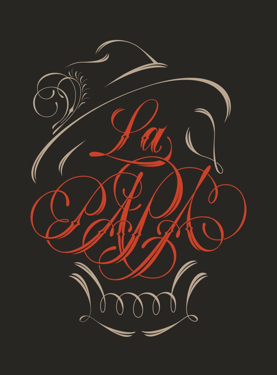
Illustrator and designer Alex Trochut has called New York City home for the past four years. A Barcelona native, he is fluent in all things design from logos and identity work, to editorial, advertising, fashion, and music. He tends to use expressive lettering often in his work to create movement and rapture.
Last year, he was asked to design the logo for a pair of businesses in Barcelona—a daytime restaurant and a cocktail bar, with gender-bending names: El Mama for the restaurant, and La Papa for the bar. Spanish language traditionally pairs “la” with feminine references and “el” with masculine. Trochut explains, “In Spanish, ‘la papa’ means going on a bender. It’s a funny translation a take on very good conditions for bad habits.”
With this in mind, he went through a lot of ideas, going back and forth with the client. “I’m more of an illustrator than a designer. If something was very bold visually, it wasn’t really working as a logo. But if I designed something really simple that worked as a logo, applied to many things, the client found it too boring. We were in between all the time,” Trochut notes.
He stepped back and started experimenting with lettering and the names. “The structure of the two words have a lot in common. They share the same vocals and the same number of letters.” He put the words on top of each other, and then he saw it: “The faces came in, and suddenly the idea changed. The style that I was using in the end lead me to the idea.”
Read rest of article at LogoLounge here.
