It’s that time of year, when the summer blockbusters are released to much fanfare with overblown, Hollywood budgets. But with so many movies hitting the theaters at once, it’s sometimes hard to decide which one to see. Fortunately, you can usually judge a book by its cover, or in this case, a movie by its title treatment and logo design. Here, Matthew Jervis and I discuss five movie logo treatments and how they stack up in the frenzied Hollywood landscape. We’ll ponder why some logos work and others don’t.
Ghostbusters
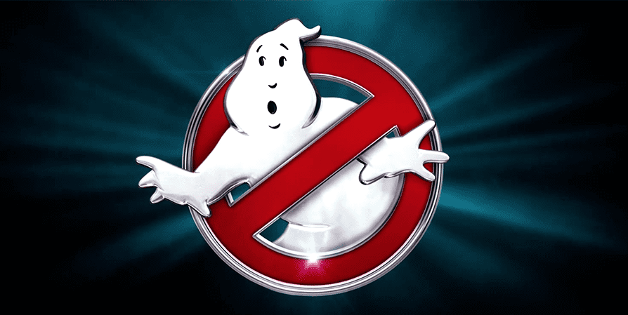
One of the most highly anticipated movies of the summer, Ghostbusters, has come a long way, featuring an all-female cast in this remake, but one thing hasn’t changed at all: the logo. Devised by designer Michael Gross and Brent Boates more than 32 years ago, the logo has not been cleaned up, touched up, or tweaked in any way. Its genius in its simplicity.
But Gross never thought it would see the light of day, as he explained in an old interview. “The logo was in the script. The guys in the film had this logo on their shirts,” so had to devise something long before the production started. So, he came up with the concept of a ghost coming out of a “no” symbol, and asked Boates to comp up several variations. He never expected the logo to take hold the way it did, yet here we are 32 years later, and it still endures.
In the 1989 sequel, the logo was cleverly changed to show the ghost holding up two fingers. Ghostbusters merchandise has been flying off the virtual shelves of online retail outlets, showing that a good logo will stand the test of time, even if it’s for a fictional company.
Take away: Don’t mess with success.
Finding Dory
“The sequel to Finding Nemo, uses the same unique typeface, but it works better with Dory,” says Jervis. “The big round letter shapes of the ‘D’ and the ‘O’ in Dory make it look a little clunky.” Whatever little design issues we have with the type treatment, doesn’t seem to affect box office sales, as Finding Dory had the highest grossing debut of all time for an animated feature.
Take away: “Sometimes sticking with the branded look doesn’t work, but you go with it anyway.”
Suicide Squad
This movie, based on the DC Comic, has all the trappings of an action-based thriller, featuring a team of dangerous villains sent on a covert mission. Jervis says of the logo, “The punk rock aesthetic with a thrown-together placement really reflects the theme of the film. I like this logo for that reason.”
Take away: “The logo lives up to the expectations of the film.”
The Nice Guys
With leading men like Russell Growe and Ryan Gosling, you can hardly go wrong, but the title type treatment may be a little misleading. It seems to indicate this is a fun romp through the disco decade. “It’s a Cool logo typeface, pretty 1970 cliché look. It captures the time this film is set, but doesn’t reflect that the story is pretty dang violent.”
Take away: “We like the kitchy disco ’70s vibe. It always sells.”
Eat That Question
The documentary on the always controversial Frank Zappa, captures his story in mostly his own words. Unfortunately, the title design lacks any of the quirky tendencies of the artist, himself. He was an eccentric, eclectic musician known for speaking his mind, no matter the consequence, but the generic lettering overprinted on his face, doesn’t give the audience much to chew on. Jervis notes, “Apparently the studio decided not to spend any money on a real title design.”
Take away: You get what you pay for.
