Logos designed by Chad Michael often have an aura of history, as if the companies they represent have been around for hundreds of years, when in fact, most are start-ups. Crests and custom lettering often create this sense heritage. “The crest or seal structure, dates back to ancient Greece, China, and the Roman Empire. It appears on the world’s first coin currency, metalsmith markings, pottery, etc. It has evolved over time to carry immense power and memorability with everyone,” Michael explains. “The crest structure has the freedom to carry a lot of brand messaging. It can encompass illustration and typography in a demanding way that typically works well in a variety of conditions. Humans also love symmetry and a crest structure usually possesses that.”
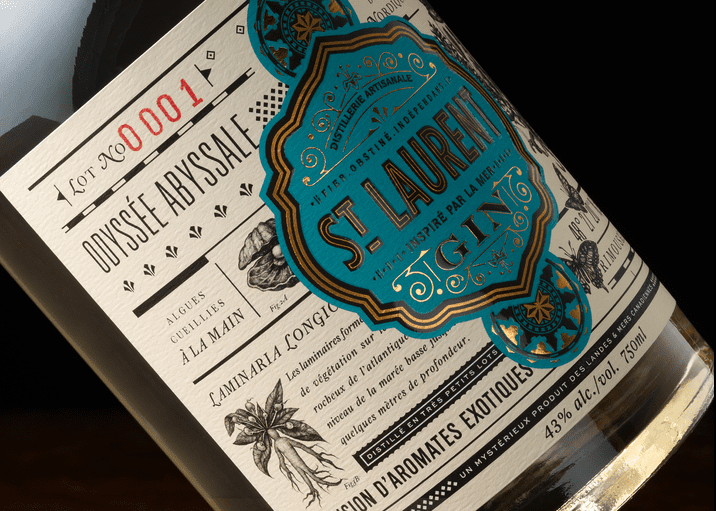
St. Laurent
St. Laurent is a brand built on mystery and nautical references—like something that has been lost at sea. “The research and strategy brought up many older references of nautical charts, which typically possess a very illustrative crest image that contains the map name. This visual research set the foundation for the design,” he says.
The package design development also pushed the need for a crest. He notes, “As with 99 percent of the brands I design, the logo and package design are developed simultaneously. You can’t have one without the other. The crest pushed the branding to the forefront and gave it an iconic look.”
The teal color was another element that really contributed to the success of the design because it’s so unexpected in this category. It has nautical references and actually adds a sense of modernity to a design with so much vintage influence.
“The success of this product has gone beyond expectations and I am now working with the client to develop a complete range of products: A barreled aged Gin, Whiskies, and Rums,” Michael says. “Each new product will keep the same design foundation but the crest and vibrant color will change with each offering. This will give the entire brand a kinetic system of family crests.”
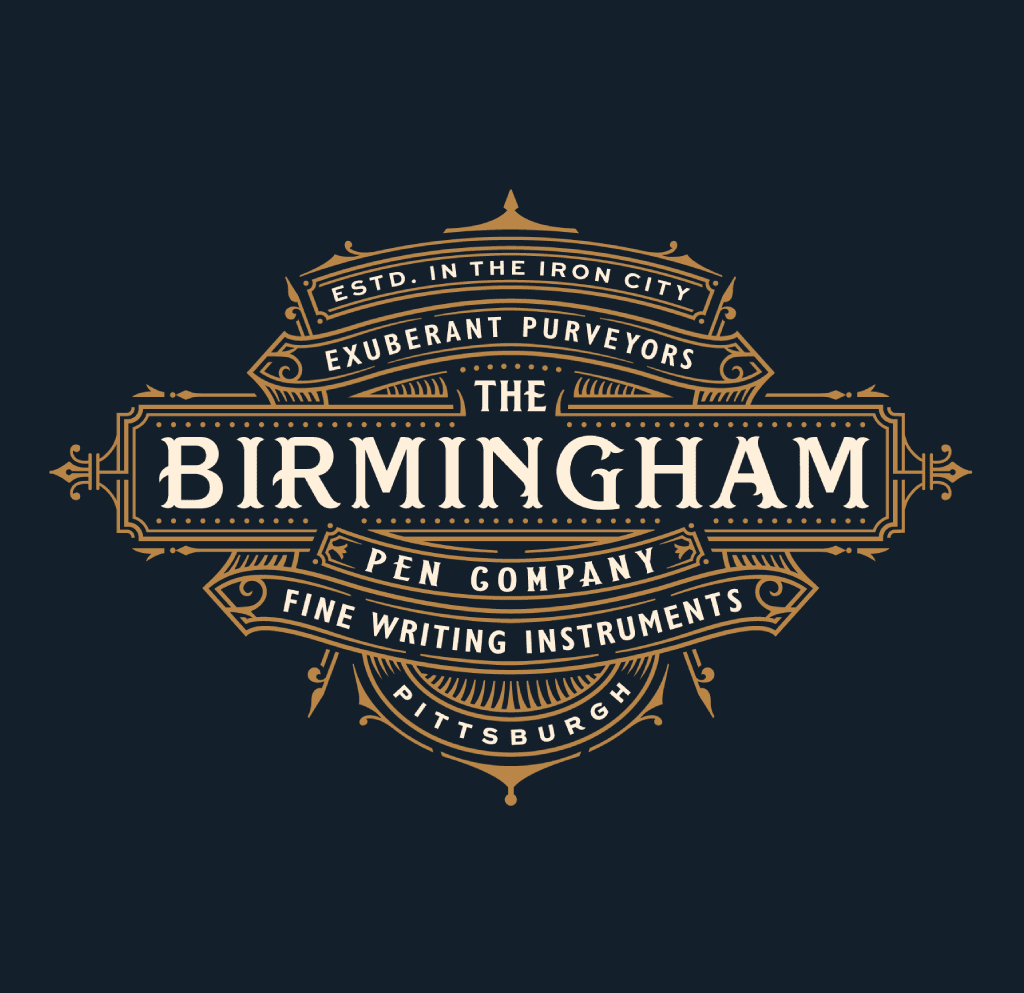
Birmingham
Michael is also known for his custom lettering for clients, and often those solutions have an Old World aesthetic. Birmingham Pen Co. crafts and sells quality writing instruments. “The goal behind the primary logo was to create a design that had a sense of provenance, establishment, and luxury,” he explains. “The overall inspiration came from the concept of iron-work, which is abundant throughout Pittsburgh, is one of the city’s nicknames, and evokes a strong sense of handcraft which is a strong characteristic of their products.”
In his type explorations, he toyed with this idea of iron-work in many ways while also exploring older London-inspired typography, “so the logo had the feeling that it had been around for a while. It gave it a sense of establishment.”