Graphic design is all about solving problems and making things functional and easy to understand, and wayfinding materials such as signs and maps aren’t the exception. In fact, they’re the rule. If the information is wrong or misunderstood, there can be deadly consequences. But not all maps are life and death. Some can be really fun while providing factual information, such as maps for parks, playgrounds, museums, and more.
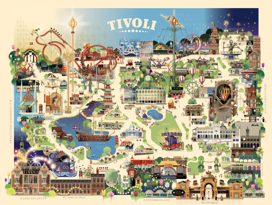
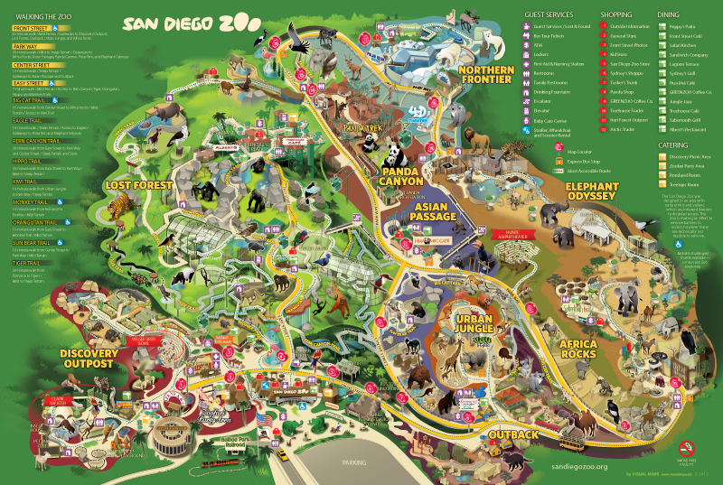
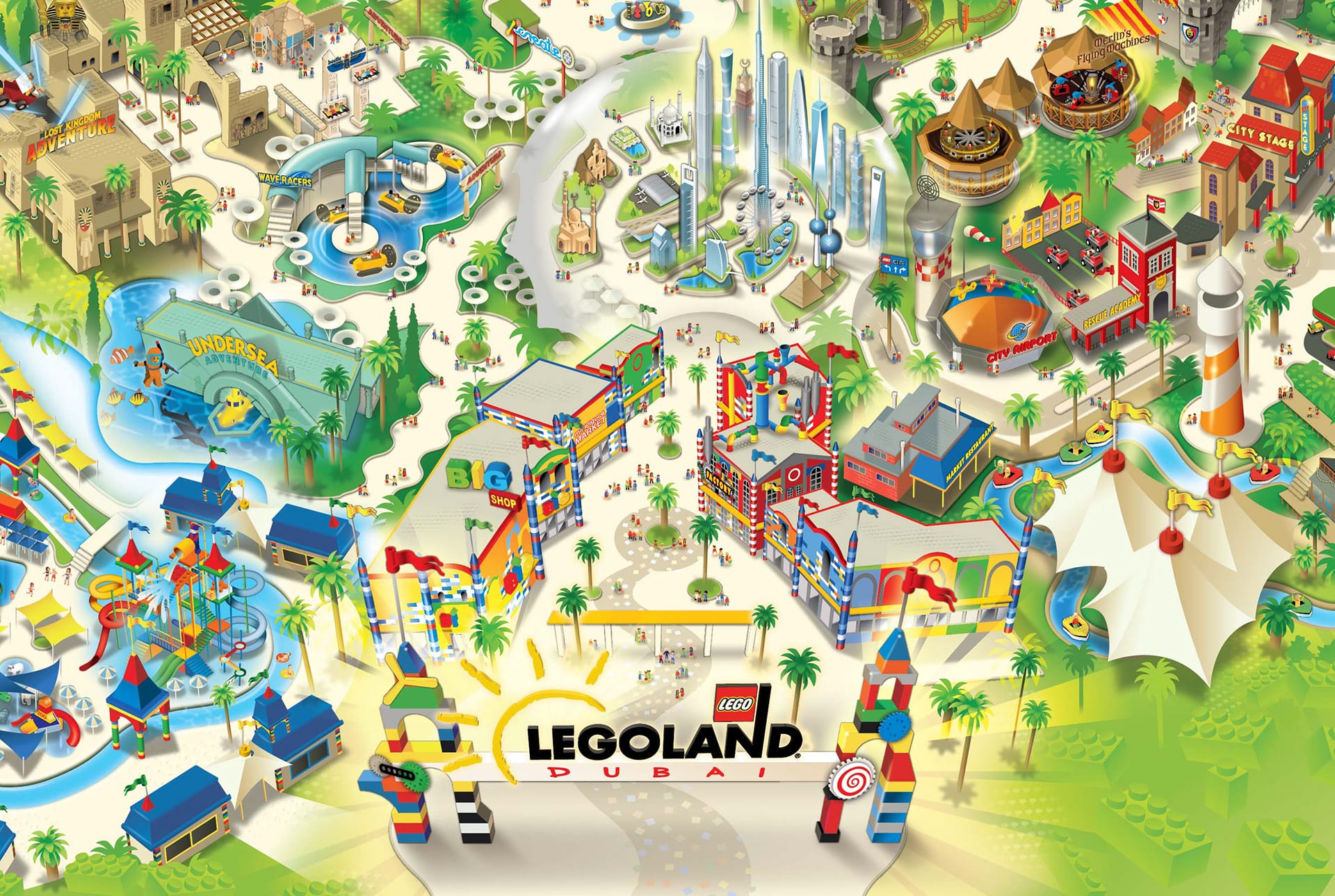
One company that knows how to put the fun in mapmaking is Visual Maps based in Copenhagen, Denmark. They’ve designed colorful, richly detailed maps for parks all over the globe for the past 20 years. “It started with an illustration for a DUPLO universe on a LEGO package I did, which was spotted in Legoland, which then commissioned me to do their park map,” explains founder and creative director Mads Berg. Since then, they’ve designed all the Legoland parks worldwide, and have specialized in park maps since.
Here are five tips for creating successful map designs.
- Combine fact with fiction for emphasis
Designing wayfinding maps for parks isn’t so much scientific as it is illustrative. Sure, you need to help visitors find their way around the park, but it’s much more loose and playful than a city map. “There’s a mixture of reality and fantasy in each design,” he notes. “Google does the reality thing beyond compare. We love to do the fantasy part.” Of course, they do this without overriding the wayfinding purpose.
- Visit the park to get perspective
Although Google Maps is a great resource, Berg always starts projects by visiting the actual park, “not only to see the facilities, but also to experience the park as a visitor and know the points of navigation and get a first-person point of view.” Make note of the biggest attractions and their popularity. Often, these are points of interest that draw visitors to the park in the first place, so capitalize on them in your design by making them prominent.
- Sketch it out
When he’s back in the studio he does a pencil sketch to get the point of view right and define the composition. “Then we do a digital disposition map, where we take all facilities/rides/buildings individual height/volume in to account, and lay it all out,” Berg says, adding, “It remains a nice challenge to detangle the pathways, and to distribute everything, keeping the pathways correct, but at the same time focusing on and exaggerating individual features.” The biggest challenge is capturing all the landmarks and details in miniature, while still making them easily identifiable, as well as capturing the topography. In a zoo, for instance, different animals require different habitats, like water or vegetation, so be sure to visually represent them where applicable.
- Use Color as a differentiator
Color is a major factor in map design, not only to represent actual points of interest, but to use as identifiers. For instance, use a color key to identify things such as restaurants, gift shops, restrooms, exits, etc., for quick reference. Berg says of his maps, “Each park has its own colorways and atmosphere.” Be sure to capitalize on this as part of the overall brand strategy.
- Keep it real and keep it fun
He admits that he likes balancing the realistic demands of accuracy and wayfinding with the aesthetics, by exaggerating details and colors to create intrigue and beauty. “I especially like Tivoli Gardens and Liseberg because of this equal balance between aesthetics and navigation service. They both have poster qualities as well as being a good guide.” Use icons and buttons to help identify and locate points of interest. It can be frustrating for a visitor, if the map shows one thing and in reality, it’s completely different.
The tips above can be adapted for any kind of map project, just be sure to capture the fantastic qualities that draw visitors and help them get around the park, museum, school, or city safely.