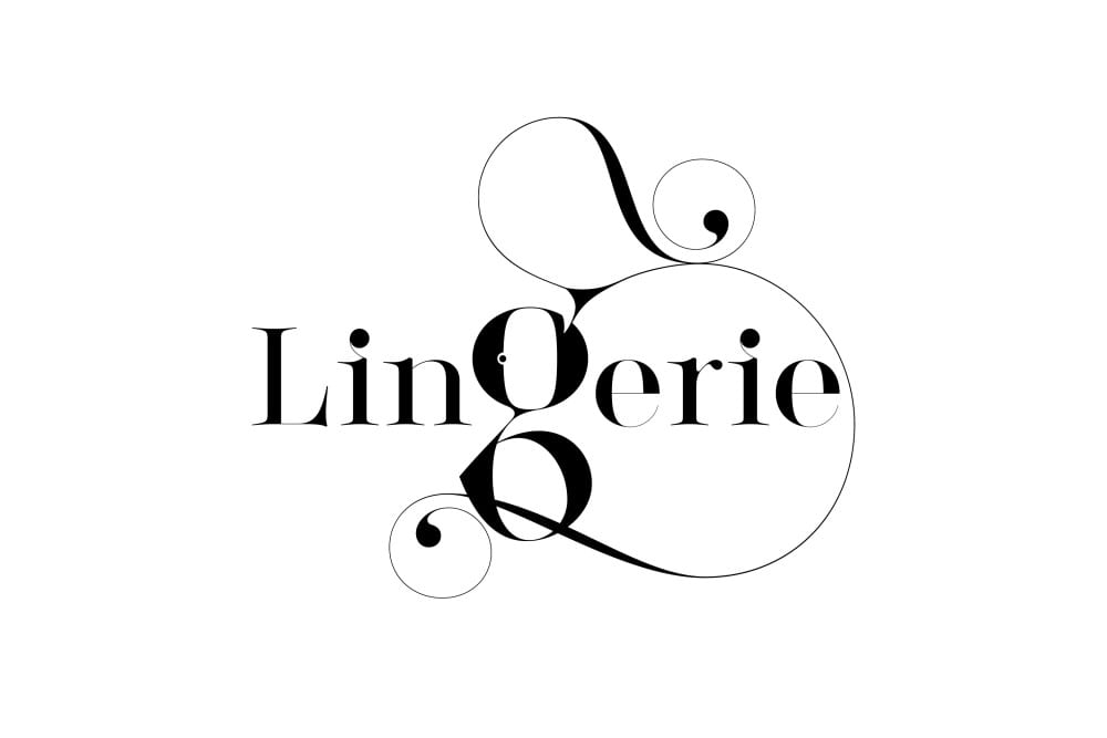
Born and raised in Israel, Moshik Nadav has always had an affinity for letterforms and typography. He immersed himself in graphic design journals at a young age, admiring and studying the work of the masters. While still a student of graphic design, his type designs were gaining recognition by leading international design publications and major online typography and design blogs. By the time he graduated, he had already designed four typefaces.
Nadav established his design business, Moshik Nadav Typography, in 2009, serving a variety of international clients, and in 2013, he moved to New York City. His distinct style can be attributed to his love of fashion and his adoration of the female form. Just as a fashion designer must consider the drape of the fabric on a human figure, Nadav’s affinity for sleek lines and sexy curves are distinct characteristics of his typefaces, which include contrasting line strokes, and delicate, extended serifs that entwine and envelop each other. Every element in his unique letterforms is carefully considered as he bends and manipulates each shape and tendril, while respecting the rules of typography and readability. When an entire alphabet is finished, it’s like a new fashion line hitting the runway—each letter is unique on its own, but when seen as a family, it all works together and it’s undoubtedly Moshik Nadav.
Read the full interview with Nadav here, where he discusses his latest typeface, Lingerie.
