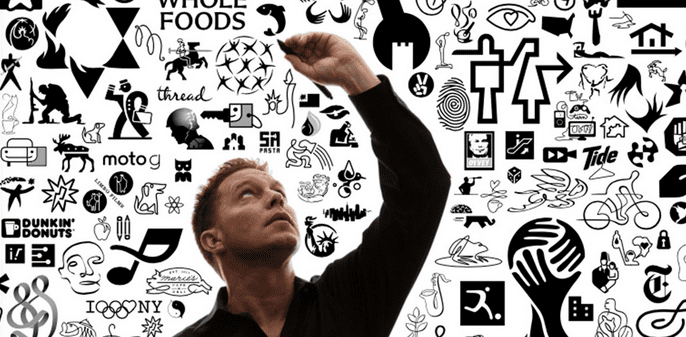
Icons have become such a ubiquitous way of life for most of us, that we don’t often think about them. And the point is, we shouldn’t, unless they misguide us or leave us confused. In Felix Sockwell’s new book, Thinking in Icons, he walks readers through the process of designing icons and the subtle nuances that can make or break the design.
“Icons affect our daily lives, similar to typography. It’s something we don’t take much notice of until it’s wrong,” Sockwell says. “For instance, in Penn Station—a place where millions of commuters pass through—there’s an icon in the main hall that denotes ‘gift shops,’ showing a pipe, a gift (with ribbon), and a book. It makes no sense to most people. And no one sells pipes–you can’t even smoke outside in many New York City public spaces–but that icon has been there forever, and it probably always will be. I find strange pleasure pointing out odd things like this to people. It’s one of the reasons I’m no longer married.”
He’s also fascinated by the evolution of some icons, such as the “share” icon. “It started out clunky, within a box and with rounded edges. Now it’s a 3D arrow, and it’s quite effective,” he notes. “A lot of mistakes turn into good, useable icons. My book is an honest conversation about how icons are used, designed, conceived and understood. Designing icons isn’t a sexy or even known practice within the profession. Most designers take it upon themselves to either use an old system or tweak things to feel new or proprietary. I’m more interested in the bigger steps and mistakes that lead to workable solutions.”
And he shares it all in the book, admitting in the introduction, “Ninety percent of the work shown within these pages is completely fake—drawn up in the sidebars of actual assignments. Some of them are redrafted explorations, staged buffoonery cloaked in optimism.” Even so, you get a front row seat into the thought process, and the many considerations that go into a simple mark.