In the February issue of Print, we reached out to highly respected type-design aficionados and asked them which type designers we should all be watching. Each person featured has a unique take on their craft, and has had success with at least one typeface.
Here are two more type designers to follow in 2015.
Berton Hasebe
Sunnyside, NY; www.bertonhasebe.com
“Berton brings a freshness to typeface design that is rarely seen. His inventive fonts are reshaping the ways in which typographers, and their audience, are accustomed to thinking about type.” —Ken Barber
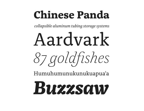
“While studying graphic design, I liked the idea of using the typefaces I drew in my own work. I appreciated the time and effort that went into making a typeface, and realizing how much experience is necessary motivated me to continue practicing,” Berton Hasebe says. Taking that initiative, he attended the Type and Media master’s program at the Royal Academy of Art, The Hague. While there, he designed Alda, which started as an exploration of different weight characteristics of letterforms, comparing them to physical objects. He liked seeing how far he could push type design standards and create something that would still be relevant and useful. Although Hasebe still likes to push boundaries, he is a bit more practical in his approach. Read rest here.
Terrance Weinzierl
Grand Rapids, MI; www.monotype.com
“Terrance is a terrific young designer whose work ranges from delightfully fanciful calligraphic lettering to industrial-strength sans serif typefaces—and pretty much everything in-between.” —Allan Haley
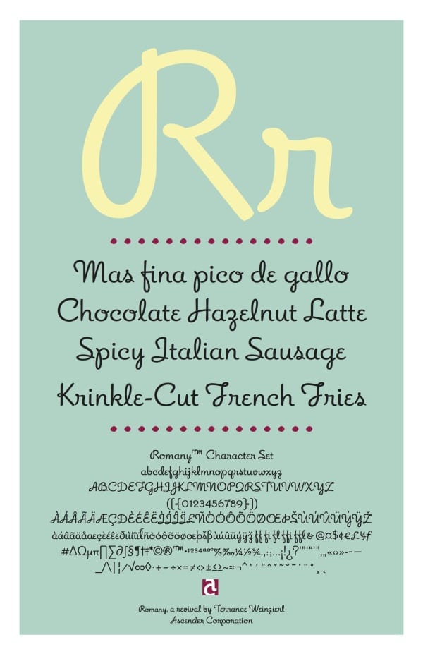
“When I found out that not all type designers are dead, and that it was a contemporary practice, I wanted to learn more,” Terrance Weinzierl recalls. “I remember exploring Adobe Caslon Pro in depth, and learning about OpenType features. Then, in an advanced typography class, I was assigned to design a typeface. I was hooked.” Read rest here.